What version of Painter were did you use Dave? I did my first pro digital inking with Painter and it worked really nicely for me. I use Photoshop now tho because I can do everything there. Manga Studio has a really nice set of tools and has something of a more natural feel to it, not to mention that auto smoothing is awesome. Can't get on with inking in Illustrator. Vectors are great for some forms of art, particularly a cartoony style, but I'm not keen on it for a more harder edged comic style.
- Welcome to 2000 AD Online Forum.
This section allows you to view all posts made by this member. Note that you can only see posts made in areas you currently have access to.
#17
Creative Common / Re: Attempts at the sample scripts
06 May, 2010, 11:08:33 PM
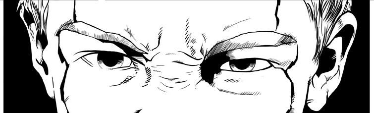
Here's a little sneaky peak from page 1 of Cycle of Violence. You can probably tell it's panel 3 and I'm happy with how it's turned out. This is my first real go at seriously working exclusively digitally. More to come over the weekend hopefully...
#18
Creative Common / Re: Mark Millar looking for 2 or 3 page stories
06 May, 2010, 08:18:11 PMQuote from: Emperor on 06 May, 2010, 08:13:10 PM
Thanks of the info - sounds right to me.Quote from: The Phantom Artist on 06 May, 2010, 07:08:59 PM
If I didn't have Bristol to prep for in a couple of weeks I'd be so desperately looking for a writer right now!
Not even a sneaky single pager? I have one written and ready to roll.
Dude, it's really tempting but I've been promising to show Tharg some Tooth pages since the BICS before last, so I really need to get something done. If you've not got anyone (or you have another) after the 23rd of this month, I'm definitely your guy!
#19
Creative Common / Re: Inking tools - let's brush up...
06 May, 2010, 08:15:01 PM
I always preferred pens, just regular fine tip pigment markers. I had to almost draw each image twice, having to sculpt the defining lines and then fill them with solid black. Since getting my Wacom and Photoshop, I've never looked back, being able to have the flexibility of a brush but the feel of a pen. Takes a good bit of getting used to, especially working exclusively in PS, but no danger of spilling ink, water and no mountain of eraser dust. Not for everyone but I'd highly recommend it.
#20
Creative Common / Re: Mark Millar looking for 2 or 3 page stories
06 May, 2010, 08:03:57 PMQuote from: Jim_Campbell on 06 May, 2010, 08:02:40 PMQuote from: The Phantom Artist on 06 May, 2010, 07:58:13 PM
it'll be the A3 format as the US format tends to get lost on the stands.
A4?
Cheers!
Jim
Sorry Jim, yeah I meant the art will be prepared on A3, published in a4
#21
Creative Common / Re: Mark Millar looking for 2 or 3 page stories
06 May, 2010, 07:58:13 PMQuote from: Emperor on 06 May, 2010, 07:22:57 PM
One odd thing is he hasn't specified page size, especially if some of these will appear in the comic. I assume it'll be the same size as other Titan Magazine publication, but what is that?
Depends Emperor. When I did Transformers for them it was the same format as the Tooth but for the new wave they're doing with the WWF they're using the American format. My guess would be, as Clint is going to be on British newsstands, it'll be the A3 format as the US format tends to get lost on the stands.
#22
Creative Common / Re: Mark Millar looking for 2 or 3 page stories
06 May, 2010, 07:08:59 PM
If I didn't have Bristol to prep for in a couple of weeks I'd be so desperately looking for a writer right now!
#23
Off Topic / Re: Life's so drokking fantastic because (the rebirth)
05 May, 2010, 05:31:56 PMQuote from: Jim_Campbell on 05 May, 2010, 04:05:44 PM
In addition to now not being bounced from the highest profile US book I've worked on to date, I think I've mustered the finance for a Cintiq.
I think a celebratory libation at a local hostelry may be in order. :-)
Cheers!
Jim
Sooooooooooooooooo jealous!
#24
Creative Common / Re: Attempts at the sample scripts
05 May, 2010, 02:51:20 PM
Hi Dave, I'm working on this script myself so feel free to crit the hell out of mine when I post it up. Before I get started, I'll just say that I post the crits I would like to receive...
Overall, I think there's some pretty solid stuff here but there are minor niggles which really effect the overall quality. I'll break it down through the pages.
Page 1
Panel 1, the anatomy on her right arm looks off. I think it's the perspective on the upper arm, it looks really short. I could be wrong, but it also looks like her arms aren't long enough, her hands look like they'd fall just below her waist when they should fall about 6 inches lower. Otherwise, I like the angle and the debris is great.
Panel 2, the figure of the mother is too small and her right arm has moved from where it was established in panel 1, as has the broken picture frame. Following the line of Dredd's arm, the Lawgiver should be rotated more towards us so that we can see more of the top. Also, it looks like you're slightly off model with the gun making a cross between a mk1 and a mk2. It's a minor detail but the fan boys go nuts for this sort of thing. Klein snr's feet look a little too small but other than that there's some nice energy and movement. Attention to detail on the apartment is really nice in this panel.
Panel 3, Klein jr doesn't look pissed enough. He's supposed to be really angry and his expression here is very matter of fact, which is kinda cool but not what the script is asking for.
Panel 4, the composition of this panel is a little weak, I see what you're going for, but there's not enough dead space for the dialogue to breath. Also, Klein snr looks a little too composed and almost caring when he should be looking wired. I'm not sold on the character here. Also, Klein jr's expression doesn't work due to the previous panel's set up.
Panel 5, Dredd's a great shot, but with Klein jr in the way, even he'd need to be looking at the target. It's a minor niggle in an otherwise great panel, but I think it's an important thing.
Page 2
Panel 1, no complaints here.
Panel 2, looks a little too clean as was said before. Also, with the fonts you've used, I'm thinking more Saturday morning cartoon than Mega City 1. I'm not a big fan of photo's being used for backgrounds in comics and combined with the cloud mist and statue, it looks more like Olympus I'm afraid.
Panel 3, I love what you've got going on in the background with the other students, but Klein seems to be daydreaming rather than listening intently to the tutor, maybe it's the res of the shot but he doesn't seem to even be looking at the teacher, he just looks bored... The anatomy on the teacher's arm is off too, the upper arm is disproportionate to the forearm.
Panel 4, I would not want to use that toilet, the seat is huouge! The water is also too high. It's otherwise a lovely panel, but a different angle might have been nice?
Panel 5, great panel, nice atmospheric, brooding shot.
Panel 6, funnily enough this mirrors the layout of my version almost exactly. The only thing I would say is that the figures are a little stiff. Klein is supposed to beating the snot out of these guys, so a two handed 'power strike' with the daystick would have been nice.
Page 3
Panel 1, the helm doesn't look right in this panel, I'm not sure why. I can see that you've based it on Colin MacNeil's version from 'Cadet' but what worked with his style doesn't quite sit right with yours. That might just be my own opinion though.
Panels 2 and 3, nothing bad here, both work very well indeed!
Panel 4, I think the biggest issue here is the perspective. Individually, everything works brilliantly (my personal preference is for the Lawmaster to be more sleek and less boxy, but that all subjective). The figures on the right appear to be on a ledge above the street level (love the Human Taxidermy sign, brilliant). I think the main problem is that Klein and the bike are too small. Should be a simple photoshop fix. Again, your attention to detail on the background elements and debris is brilliant.
Panels 5 and 6, no complaints here except a minor point with the Lawgiver in panle 5, it looks like a movie version...
Page 4
Panel 1, same as with page 1 panel 1, the perspective on her left upper arm is off making it look too small. Her hands are also a little wonky, particularly where the thumb joins the palm. Other than that, very nice.
Panels 2-6, on the whole no major problems, the buildings look alittle flat and would benefit from a little texturing perhaps but other than that, good stuff!
Page 5
I really like this page. My only real problem is panel 5, with the shot at this angle, Klein would need to be on his knees. Nice echoing of page 1 in panel 6, but again, it would be nice to see the top of Dredd's gun.
Page 6
This is, by far, the weakest page and as was said earlier looks rushed.
Panels 1 and 3 are pretty good on the whole, just Dredd's helmet looks a little wonky in panel 3, the angles don't read right.
Panel 2, Klein's face has suddenly gone Warner Bros, there's almost a very distinct style change making him look very cartoony, the same can be said for Panel 4 too. Also, in panel 4, the anatomy of his face is wrong, his right ear is too far back. You've also not reflected the shoulder pads...
Panel 5, I can see what you were going for here with the red burst in the bg, but it does look like he's been shot when you couple it with the exression. Also, the composition is a little flat, tilting the panel a little, removing the border, a slight up angle, could have made this really pop.
Panel 6, again, I'd prefer it if Dredd was looking at Klein but otherwise nice panel again.
Stylistically, I really like what you've got going on here. Your attention to background detail is spot on. I have an issue with your Lawgivers, I see what you were trying to do with showing the passage of time, but I would have preferred it if you'd used a mk1 for page 1 and then used a mk2 for the rest (although my version currently has mk2 throughout so I will now be changing that ). I really like that you've given Klein the moles on his face so that you have the continuity over the years and you can tell it's the same character.
As has been said by others, the lettering is very weak, and I would like to see the pages without it. Your story telling is pretty sharp, but then I know the script and have the dialogue on the pages too, so that may be altering my perseption somewhat.
Was it Tharg you showed this to at Hi-Ex? What was the overall feedback you received? My guess would be that it was pretty positive...
Anyway, I've rambled on enough, time to let someone else have a go
Overall, I think there's some pretty solid stuff here but there are minor niggles which really effect the overall quality. I'll break it down through the pages.
Page 1
Panel 1, the anatomy on her right arm looks off. I think it's the perspective on the upper arm, it looks really short. I could be wrong, but it also looks like her arms aren't long enough, her hands look like they'd fall just below her waist when they should fall about 6 inches lower. Otherwise, I like the angle and the debris is great.
Panel 2, the figure of the mother is too small and her right arm has moved from where it was established in panel 1, as has the broken picture frame. Following the line of Dredd's arm, the Lawgiver should be rotated more towards us so that we can see more of the top. Also, it looks like you're slightly off model with the gun making a cross between a mk1 and a mk2. It's a minor detail but the fan boys go nuts for this sort of thing. Klein snr's feet look a little too small but other than that there's some nice energy and movement. Attention to detail on the apartment is really nice in this panel.
Panel 3, Klein jr doesn't look pissed enough. He's supposed to be really angry and his expression here is very matter of fact, which is kinda cool but not what the script is asking for.
Panel 4, the composition of this panel is a little weak, I see what you're going for, but there's not enough dead space for the dialogue to breath. Also, Klein snr looks a little too composed and almost caring when he should be looking wired. I'm not sold on the character here. Also, Klein jr's expression doesn't work due to the previous panel's set up.
Panel 5, Dredd's a great shot, but with Klein jr in the way, even he'd need to be looking at the target. It's a minor niggle in an otherwise great panel, but I think it's an important thing.
Page 2
Panel 1, no complaints here.
Panel 2, looks a little too clean as was said before. Also, with the fonts you've used, I'm thinking more Saturday morning cartoon than Mega City 1. I'm not a big fan of photo's being used for backgrounds in comics and combined with the cloud mist and statue, it looks more like Olympus I'm afraid.
Panel 3, I love what you've got going on in the background with the other students, but Klein seems to be daydreaming rather than listening intently to the tutor, maybe it's the res of the shot but he doesn't seem to even be looking at the teacher, he just looks bored... The anatomy on the teacher's arm is off too, the upper arm is disproportionate to the forearm.
Panel 4, I would not want to use that toilet, the seat is huouge! The water is also too high. It's otherwise a lovely panel, but a different angle might have been nice?
Panel 5, great panel, nice atmospheric, brooding shot.
Panel 6, funnily enough this mirrors the layout of my version almost exactly. The only thing I would say is that the figures are a little stiff. Klein is supposed to beating the snot out of these guys, so a two handed 'power strike' with the daystick would have been nice.
Page 3
Panel 1, the helm doesn't look right in this panel, I'm not sure why. I can see that you've based it on Colin MacNeil's version from 'Cadet' but what worked with his style doesn't quite sit right with yours. That might just be my own opinion though.
Panels 2 and 3, nothing bad here, both work very well indeed!
Panel 4, I think the biggest issue here is the perspective. Individually, everything works brilliantly (my personal preference is for the Lawmaster to be more sleek and less boxy, but that all subjective). The figures on the right appear to be on a ledge above the street level (love the Human Taxidermy sign, brilliant). I think the main problem is that Klein and the bike are too small. Should be a simple photoshop fix. Again, your attention to detail on the background elements and debris is brilliant.
Panels 5 and 6, no complaints here except a minor point with the Lawgiver in panle 5, it looks like a movie version...
Page 4
Panel 1, same as with page 1 panel 1, the perspective on her left upper arm is off making it look too small. Her hands are also a little wonky, particularly where the thumb joins the palm. Other than that, very nice.
Panels 2-6, on the whole no major problems, the buildings look alittle flat and would benefit from a little texturing perhaps but other than that, good stuff!
Page 5
I really like this page. My only real problem is panel 5, with the shot at this angle, Klein would need to be on his knees. Nice echoing of page 1 in panel 6, but again, it would be nice to see the top of Dredd's gun.
Page 6
This is, by far, the weakest page and as was said earlier looks rushed.
Panels 1 and 3 are pretty good on the whole, just Dredd's helmet looks a little wonky in panel 3, the angles don't read right.
Panel 2, Klein's face has suddenly gone Warner Bros, there's almost a very distinct style change making him look very cartoony, the same can be said for Panel 4 too. Also, in panel 4, the anatomy of his face is wrong, his right ear is too far back. You've also not reflected the shoulder pads...
Panel 5, I can see what you were going for here with the red burst in the bg, but it does look like he's been shot when you couple it with the exression. Also, the composition is a little flat, tilting the panel a little, removing the border, a slight up angle, could have made this really pop.
Panel 6, again, I'd prefer it if Dredd was looking at Klein but otherwise nice panel again.
Stylistically, I really like what you've got going on here. Your attention to background detail is spot on. I have an issue with your Lawgivers, I see what you were trying to do with showing the passage of time, but I would have preferred it if you'd used a mk1 for page 1 and then used a mk2 for the rest (although my version currently has mk2 throughout so I will now be changing that
). I really like that you've given Klein the moles on his face so that you have the continuity over the years and you can tell it's the same character.As has been said by others, the lettering is very weak, and I would like to see the pages without it. Your story telling is pretty sharp, but then I know the script and have the dialogue on the pages too, so that may be altering my perseption somewhat.
Was it Tharg you showed this to at Hi-Ex? What was the overall feedback you received? My guess would be that it was pretty positive...
Anyway, I've rambled on enough, time to let someone else have a go
#25
Help! / Re: ref pics
04 May, 2010, 06:43:56 PM
That's exactly what I've been looking for, I had the stuff that Colin Macneil did for the Meg strip, but it just didn't look quite right. Cheers Emperor!
#26
Creative Common / Re: Attempts at the sample scripts
04 May, 2010, 02:04:43 PM
Loving the style!