I got some useful advice from Steven Denton and Crazy Fox Machine for getting feedback on my art, so I thought I'd act on it.
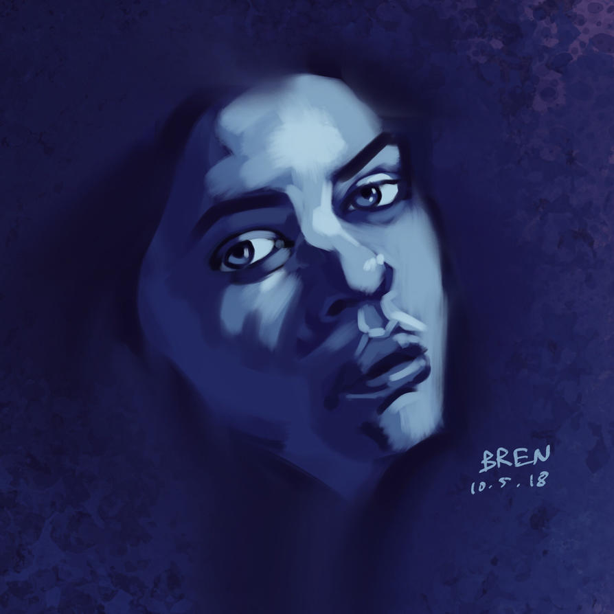
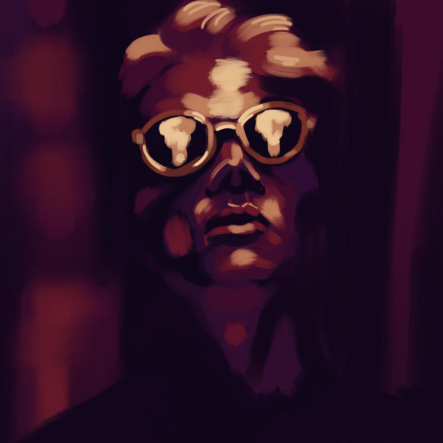
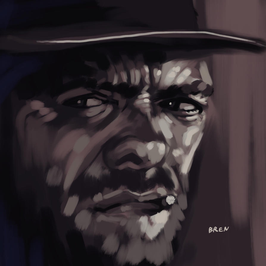
2 months ago I started experimenting with digital painting. Painting is something I've been meaning to explore for sometime but I've always been very nervous about it. It always seemed like something I couldn't do. I took a leap of faith.
I'm very much focussing my studies on figure drawing and anatomy right now. I've been painting as a warm up before I go into the challenging stuff.
Below are three recent paintings I've completed. I'd appreciate any feedback, particularly on tone and colour. Any feedback on structure and form would be great too, but tone and colour is my priority here. I think I need to use lighter tones, and add more contrast.
Please don't shy from criticism. Be brutal if you want, just keep it constructive please. A year ago someone absolutely destroyed a drawing I put on Facebook, and it turned out to be the most useful advice I ever had.
Process videos are scattered on Instagram for anyone who wants to / is willing to find them.
https://www.instagram.com/brenm/
I deliberately don't do any blending, as I think it's too easy to get distracted by finishing something, and it's not really a style I like. That's very much an opinion though and also fair game for criticism.
Apologies these aren't strictly 2000ad related, but there's a lot of very talented folks on this forum and I thought it would be a good place to start. Plus Steven suggested it 🙂
In the meantime i'll have a search for other forums / communities / blogs to request feedback.
