Glad you enjoyed it! As well as a creator droid i'm also a fan and really enjoyed the Dredd story, big fan of Stewart's art work and concur...more please.
- Welcome to 2000 AD Online Forum.
This section allows you to view all posts made by this member. Note that you can only see posts made in areas you currently have access to.
#2
General / Re: 2000 AD Cover of the Year 2020 - RESULTS!
03 January, 2021, 09:28:39 AM
Thanks so much to everyone who cast a vote for Chris and my 2211 cover.
I'm extremely humbled to have reached top 3 especially among such tough competition, there have been some stunning cover artwork throughout 2020.
A very happy new year to everyone here and I hope to get some more work in 2021, as I have mouths to feed!
I'm extremely humbled to have reached top 3 especially among such tough competition, there have been some stunning cover artwork throughout 2020.
A very happy new year to everyone here and I hope to get some more work in 2021, as I have mouths to feed!
#3
Prog / Re: prog 2184 End Times A-Coming
03 June, 2020, 03:52:43 PM
Hi all, not often I actually post anything on the forum as don't often have much to say, however there seems to be some question as to the rationale behind the use of black bordering the cover design and I thought i'd shed some light on why (I think) this is.
When I drew the cover last September/October I realised that I hadn't left quite enough room for the 2000ad logo, or at least not enough room that Dredd's head wouldn't be covering a large portion of it so decided to finish the design and then extend the top of the image electronically - which I did. My thought behind this was that it would give the graphic droids room to maneuver and move the image down as much as they felt it needed to be for the title, this would have meant losing a little of the buildings below Dredd. However I didn't convey this and assumed they would crop it as they saw fit, however, and to their credit, from what I can see from the published cover they decided to keep the image in its entirety and make up for the fact it is too long for the prog format through the inclusion of the blacks. For what its worth I actually like the black border and think it gives it a darker more sinister air which is fitting with the tagline BUT get why there is some confusion, hence me dropping in!!
When I drew the cover last September/October I realised that I hadn't left quite enough room for the 2000ad logo, or at least not enough room that Dredd's head wouldn't be covering a large portion of it so decided to finish the design and then extend the top of the image electronically - which I did. My thought behind this was that it would give the graphic droids room to maneuver and move the image down as much as they felt it needed to be for the title, this would have meant losing a little of the buildings below Dredd. However I didn't convey this and assumed they would crop it as they saw fit, however, and to their credit, from what I can see from the published cover they decided to keep the image in its entirety and make up for the fact it is too long for the prog format through the inclusion of the blacks. For what its worth I actually like the black border and think it gives it a darker more sinister air which is fitting with the tagline BUT get why there is some confusion, hence me dropping in!!
#4
Creative Common / Re: Does my Art look big in this?
14 April, 2017, 03:19:25 PM
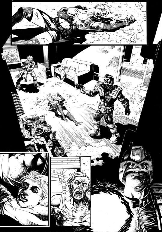
Lovely lines here Simon.
Quote from: SIP on 05 April, 2017, 05:47:43 PM
First draft Inks for a page I'm working on, still a little tweaking to do and then it will eventually be grey-shaded.
Cheers
Simon

#5
Creative Common / Re: Attempts at the sample scripts
25 October, 2016, 12:20:05 PM
Yeah really lovely pages. For the sake of offering something in the way of constructive criticism, on the first page you jump from one side of Dredd in the opening panel to the other side on the final panel - makes it jar a bit, check out the 180 Degree rule in film making, it applies to comics aswell. But as others have said that is essentially nit picking, drawing, inking, storytelling are all there, well done. 
#6
Creative Common / Re: Attempts at the sample scripts
13 September, 2016, 04:27:49 AMQuote from: MenschMaschine on 30 August, 2016, 01:43:29 PM
It's almost that time of the year again so this will be my attempt at boring everyone out of their minds with another Cycle of Violence try-out. It's the third time I've done this script ( I had another two attempts with PF and Karl-Four-Eye, though I never quite got to submit them) and I'm not so sure about the results... as usual.
Thoughts and criticism from this fine bunch are more than welcome.
Hey MM, I haven't been here for a while - I was a frequent visitor some time ago doing exactly what you are - took me 5 submissions (one of them being Cycle of Violence) and a lot of improvement over about 3 years to finally land a gig in the prog.
With regards to your work here, I would concur with Mr Denton, your biggest issue are your figures, you really need to nail the proportions and perspective. The girl in the first panel looks as though her head is floating above the floor and she should be more foreshortened as we are looking up her body from somewhere down by her feet. If you look at a figure standing square on in front of you there are around three heads down to the navel - it stands to reason that if a figures torso is foreshortened as should be the case here then that would decrease to perhaps 2 heads BUT you have 3.5 heads. Same with the second panel, you've foreshortened Dredds legs but not his arms or torso. Again with a figure square on there are around 6 heads down to just below the knee, if foreshortening this would be less but you still have six heads so his torso is too long.
On the plus your use of blacks is really nice and the page layout works nicely.
Hope that's useful.
#7
Creative Common / Re: The Dredd Head drawing thread!
23 June, 2016, 01:35:23 PM
Nice work Simon - heres a commission piece I recently completed - it's not a Dredd head 'as such' BUT certainly contains one....and part of his spine too.

#8
Creative Common / Re: Does my Art look big in this?
15 June, 2016, 08:23:25 PMQuote from: Jon on 14 June, 2016, 03:26:26 PM

Clicked the wrong quote!! I was referring to this one!!
#9
Creative Common / Re: Does my Art look big in this?
15 June, 2016, 08:22:13 PMQuote from: Jon on 14 June, 2016, 03:39:07 PMQuote from: Tulio_Vilela on 11 June, 2016, 02:18:20 AM
Great! I wonder the two illustrations as covers for a magazine like 2000 AD or Heavy Metal ou as covers for RPG books. Your work has a professional look! Cheers!Quote from: Jon on 17 April, 2016, 09:15:30 PM
Variations on a theme (providing they show up this time).
One for proper, paid work, the other for shits 'n' giggles;
Lovely work Jon, that building below have a lovely oil painting quality about it - stunning work sir.
Oh hey, hi! Just seen this,
Yeah, they're both for tabletop game publications, I do a bit of that sort of illustration on the side when time allows... well, the zombie wasn't, it was proposed as a small press cover, but it wasn't suitable. It since got picked up for a game though, Strange Arcana.
Thanks for asking!


#10
Prog / Re: Prog 1982 : The World's End
05 June, 2016, 10:28:56 PM
Bit of a delayed response so apologies - for some reason I couldn't post on this thread but I've been informed that I now can AND that I have my new creator stars!! We'll see once I post this.
I Just wanted to thank you all for the kind words on my debut in the prog with Timeless Assassin and hope I get the opportunity to bring you more.
Cheers!!
I Just wanted to thank you all for the kind words on my debut in the prog with Timeless Assassin and hope I get the opportunity to bring you more.
Cheers!!
#11
Creative Common / Re: The Dredd Head drawing thread!
26 March, 2016, 12:20:45 AM
Thanks chaps. SS that is a superb helmet.
#12
Creative Common / Re: The Dredd Head drawing thread!
23 March, 2016, 09:00:19 PM
After seeing the lovely inks and colours you guys were throwing at yours I thought i'd have a bash at mine.


#13
Creative Common / Re: The Dredd Head drawing thread!
20 March, 2016, 07:41:58 PMQuote from: Jim_Campbell on 20 March, 2016, 09:30:54 AM
Lovely stuff, folks. Can't remember if I posted this one already? I couldn't see it flicking back through the posts. Procreate, Apple Pencil:
Cheers!
Jim

Wow that's lovely Jim, what are you using there?
#14
Creative Common / Re: The Dredd Head drawing thread!
19 March, 2016, 08:17:12 PM
Thanks Hawkmumbler, much appreciated.
Great bottom lip on your piece, Bolland wouldn't need to tweak that bad boy. I personally always struggled with the length of the helmet but have settled on the fact that it looks right (for my take on Dredd's face) if I line it up with his jaw line.
Great bottom lip on your piece, Bolland wouldn't need to tweak that bad boy. I personally always struggled with the length of the helmet but have settled on the fact that it looks right (for my take on Dredd's face) if I line it up with his jaw line.
#15
Creative Common / Re: The Dredd Head drawing thread!
19 March, 2016, 06:18:25 PM
So following my original post of the Dredd profile on my FB page, Brian Bolland stopped by and tweaked my original image leaving this on my wall with the message, "I think he needs a fatter lip". 